project
Making urban nature
accessible to city folks in Copenhagen
role
UX- and Product Designer
client
The Danish Agency of Nature
year
BA Thesis - redesign 2021

Summary
With Copenhagen expanding its city limits, The Danish Agency of Nature had an opportunity to introduce a new urban wilderness to the citizens of Copenhagen; Park New West Amager.
The mission to educate Copenhageners about nature and offer access to a healthy outdoor lifestyle made The Danish Nature Agency want to explore the possibilities for developing a mobile application to attract and engage potential visitors and help them experience the park and its offerings.
As my BA thesis in Informatics and Experience Design, I got to apply my knowledge in human-centered design to help The Danish Agency of Nature, designing a prototype of an app to help Copenhageners to access and experience Park West Amager.
“We need to establish new platforms where people can be allowed to access the nature as up-close and intimate experiences because I believe that, in the end, it helps us to inform people about the importance of nature and preserve it in the long run”
-Jes Aagaard, Park Ranger in Chief
how might we
How might we design a mobile application to strengthen the publicity of Park New West Amager and help visitors experience the offerings of the park?
SOME OF MY RESPONSIBILITIES
→ Collaborate with 3 fellow students.
→ Plan and conduct user research.
→ Design and facilitate a design workshop.
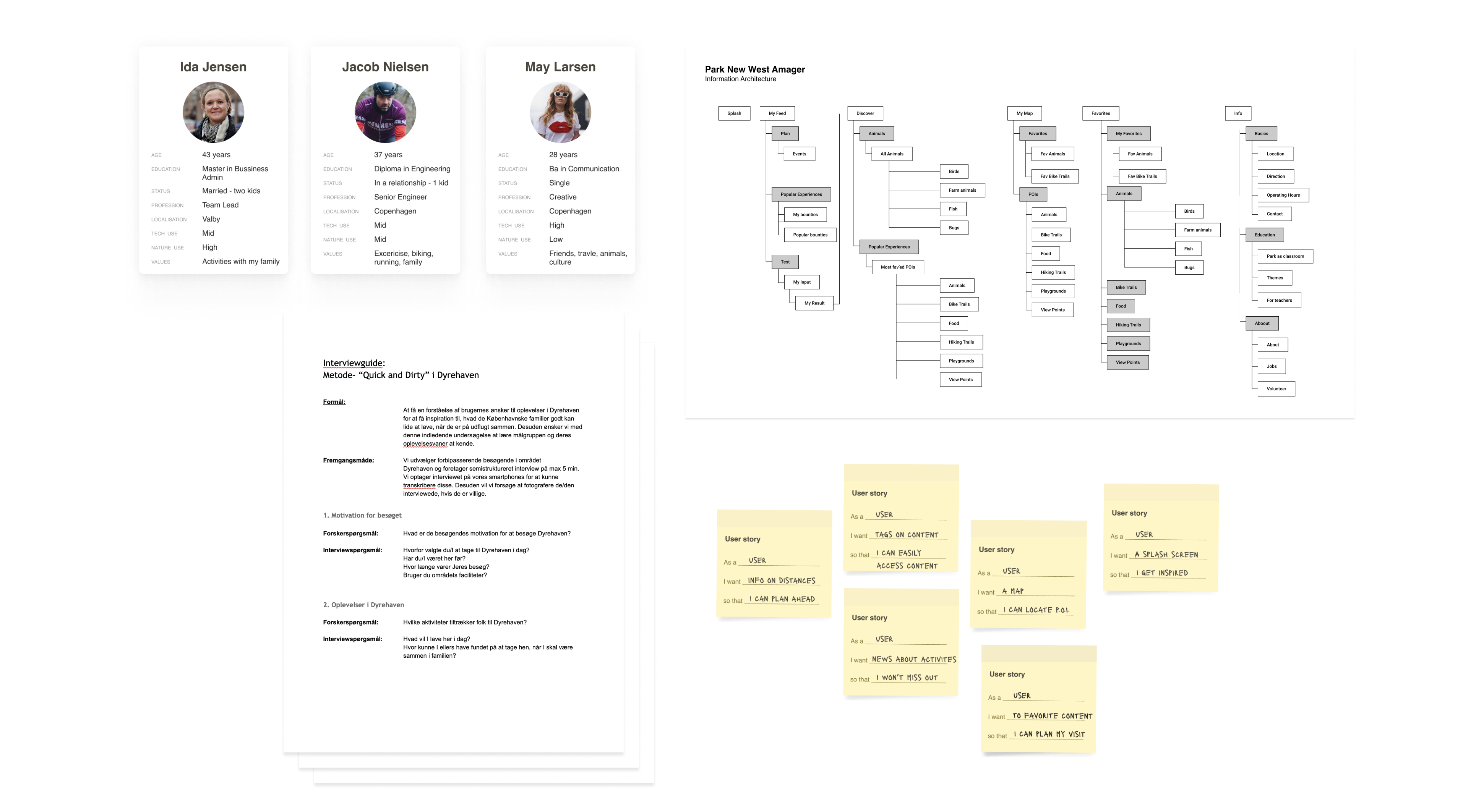
→ Define personas, IA, and user stories.
→ Design user flows and wireframes in Figma.
→ Create interactive prototypes using Figma.
→ Interview test users.
→ Design high-fidelity mockups using a UI kit.
→ Create the visual design using elements from existing branding material and an illustration kit.
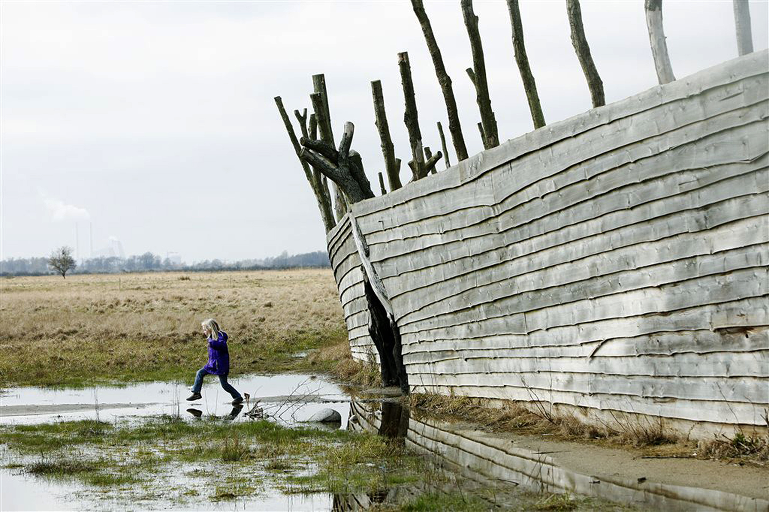
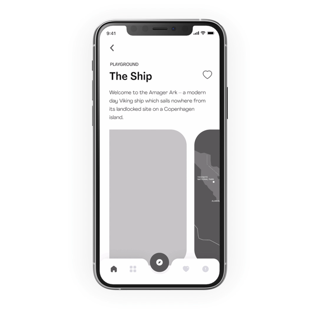
Kid playing at "The Ship" in Park New West Amager
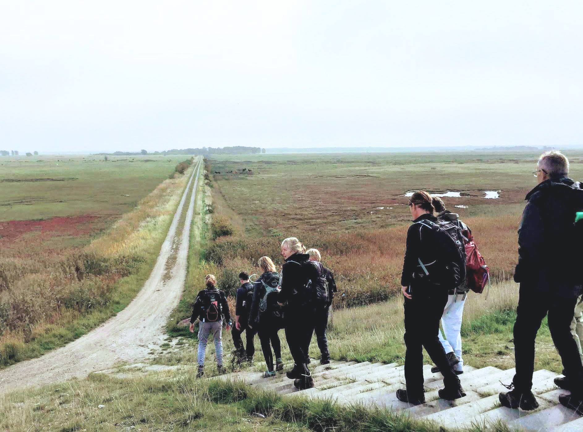
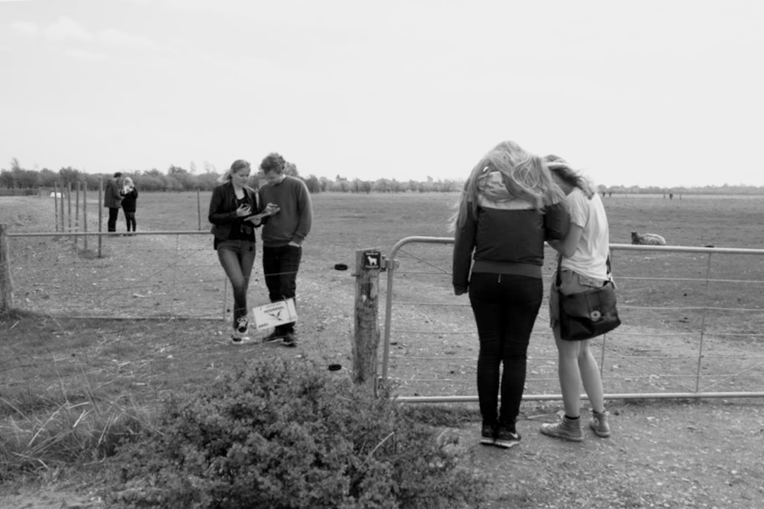
Hiking in open the fields of park new west amager
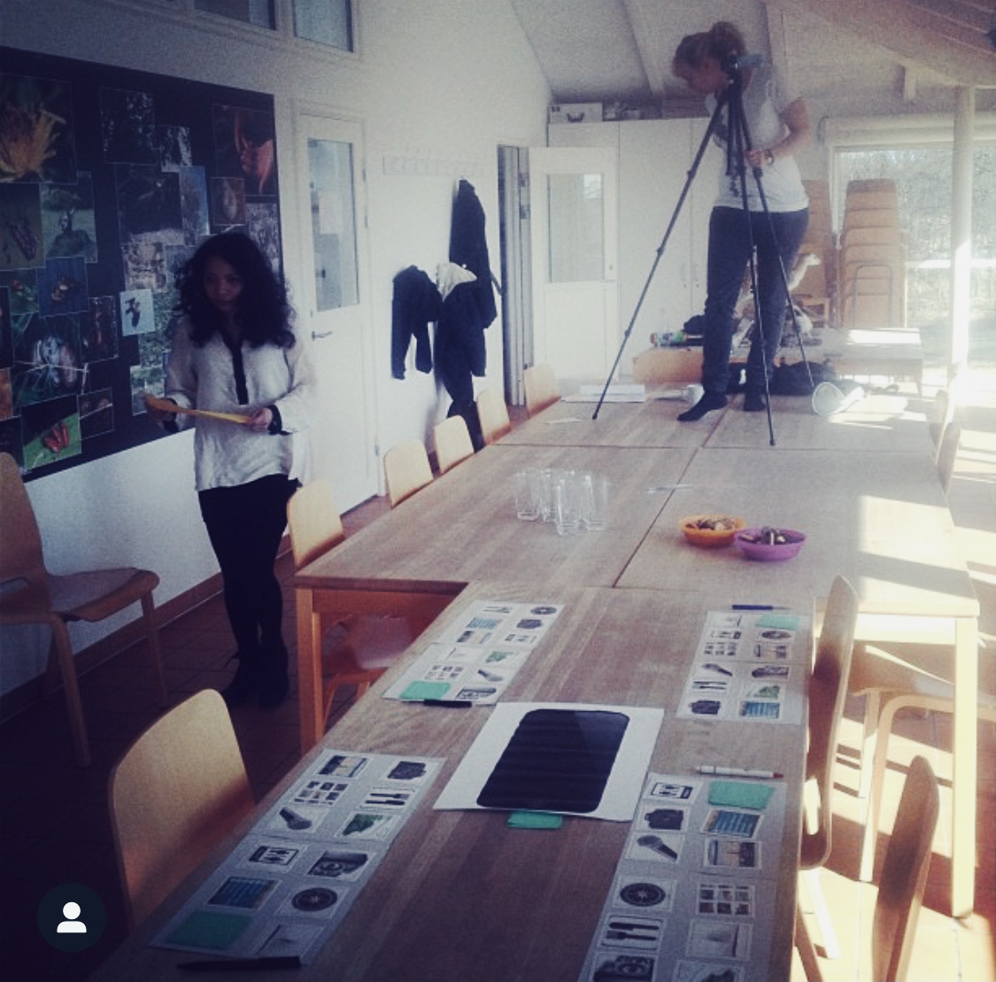
1. User Research
To get a holistic understanding of not just Park West Amager, but also the different ways people engage in planning an outdoor trip, we performed field studies, contextual interviews, stakeholder interviews, hosted a co-creation workshop, and also performed in-site user testing of the solution.
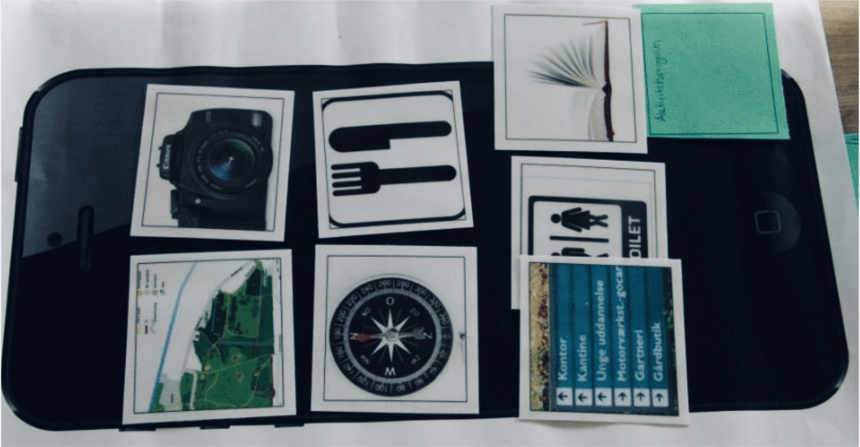
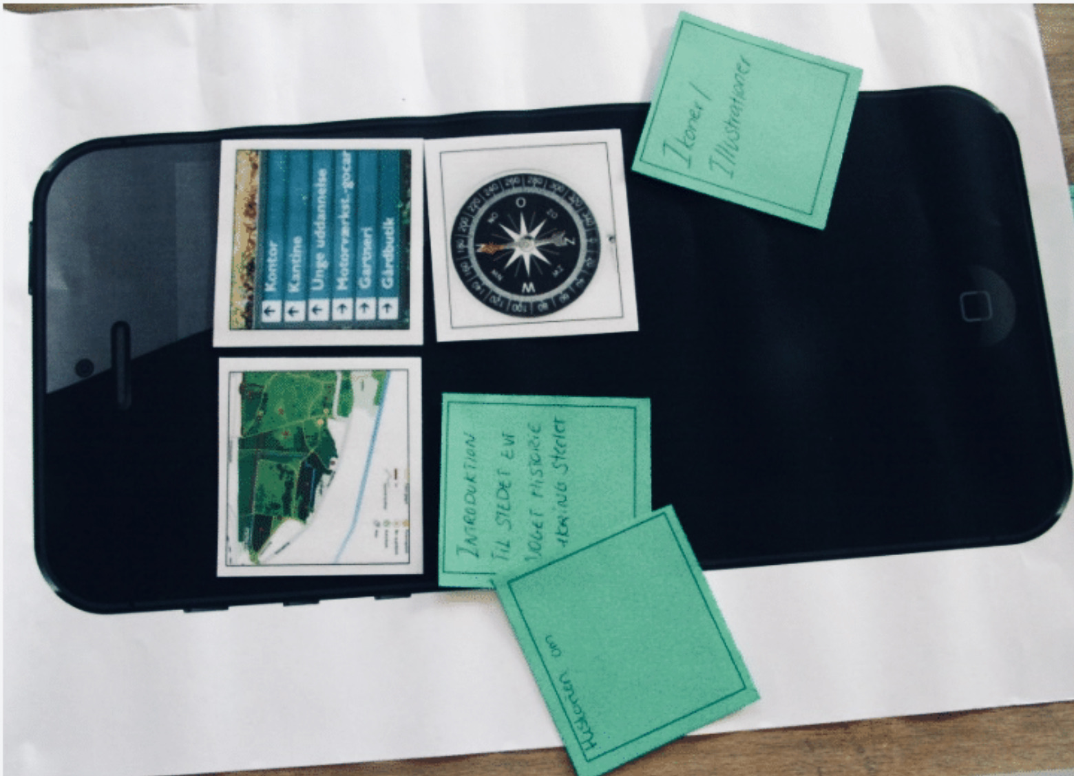
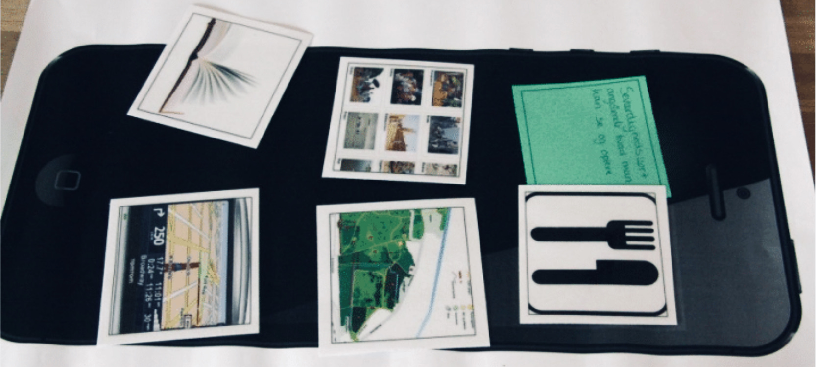
In the workshop, we wanted to gain insight into people's planning and overall experience of planning and carrying out a trip to a new place while also gaining insight into which tools could help users resolve their pain-points. We let the participants' map out their user journey from the stages of planning their trip to returning home with new experiences and memories. In the workshop's second part, we got the participants to design their own toolbox with tools to plan, navigate and experience Park New West Amager.
User interviews
Co-creation
workshop

User journey
mapping
Field studies and contextual user interviews
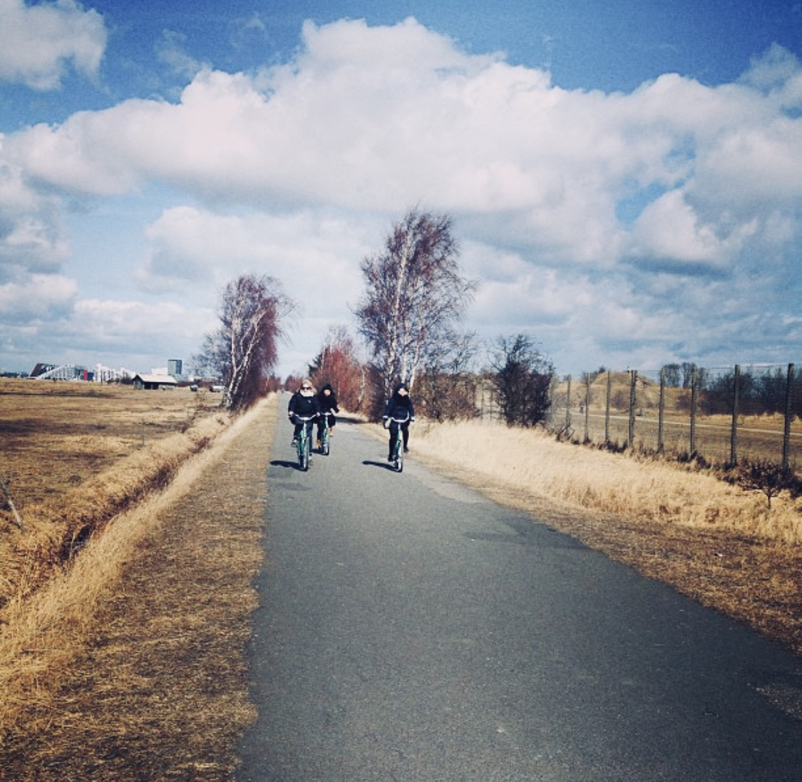
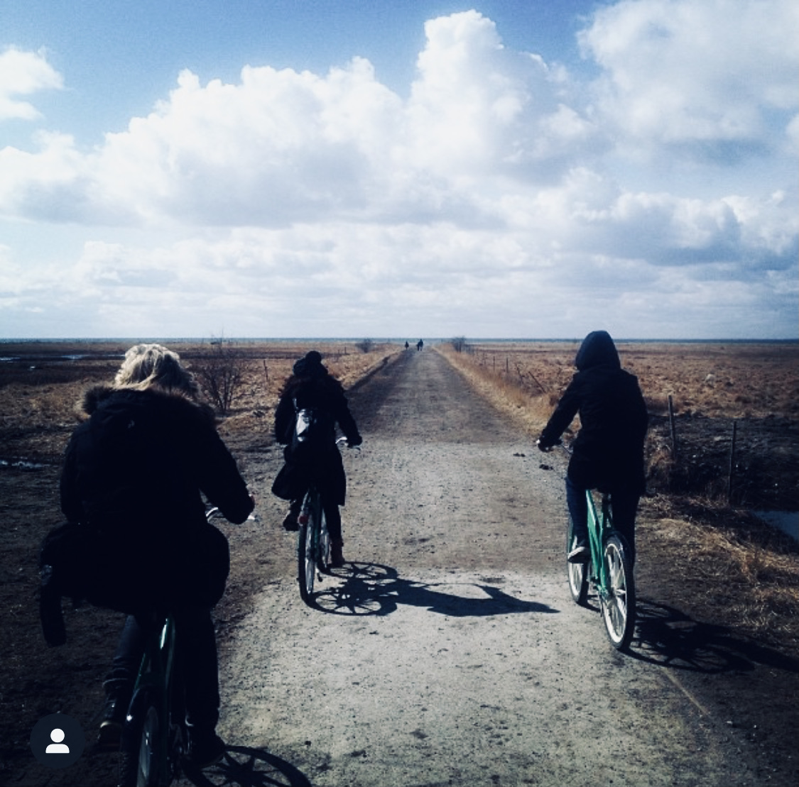
My team and I carried out contextual user interviews by exploring Park West Amager and getting to know some of the users of the park. We biked the open fields, talked to families on playgrounds and people hiking and exercising in the area.
We learned about the parks offerings, distances, and terrain and got an initial insight into the different users, and their thoughts about Park New West Amager.
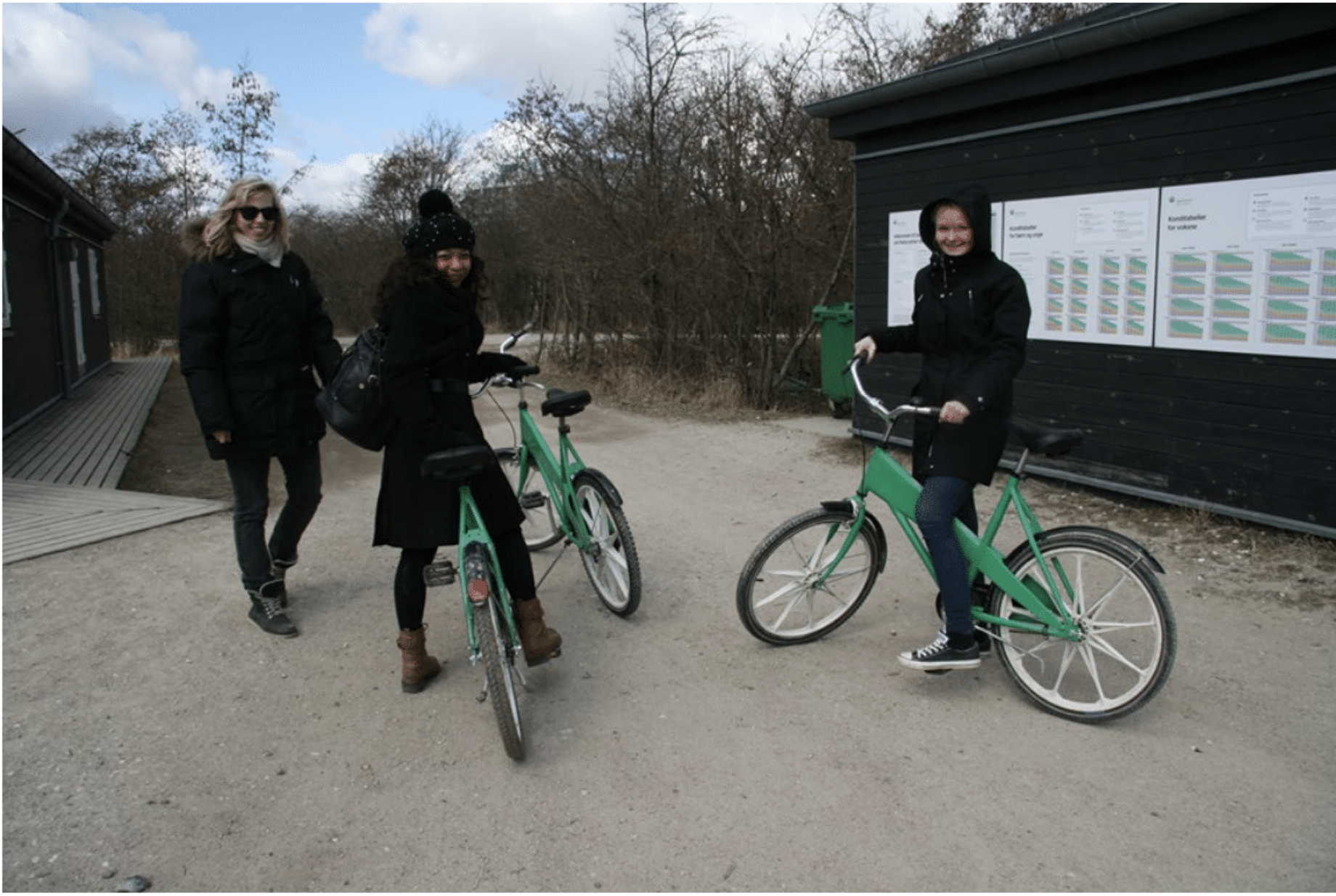
Exploring the area by bike
Workshop: Play as co-creation
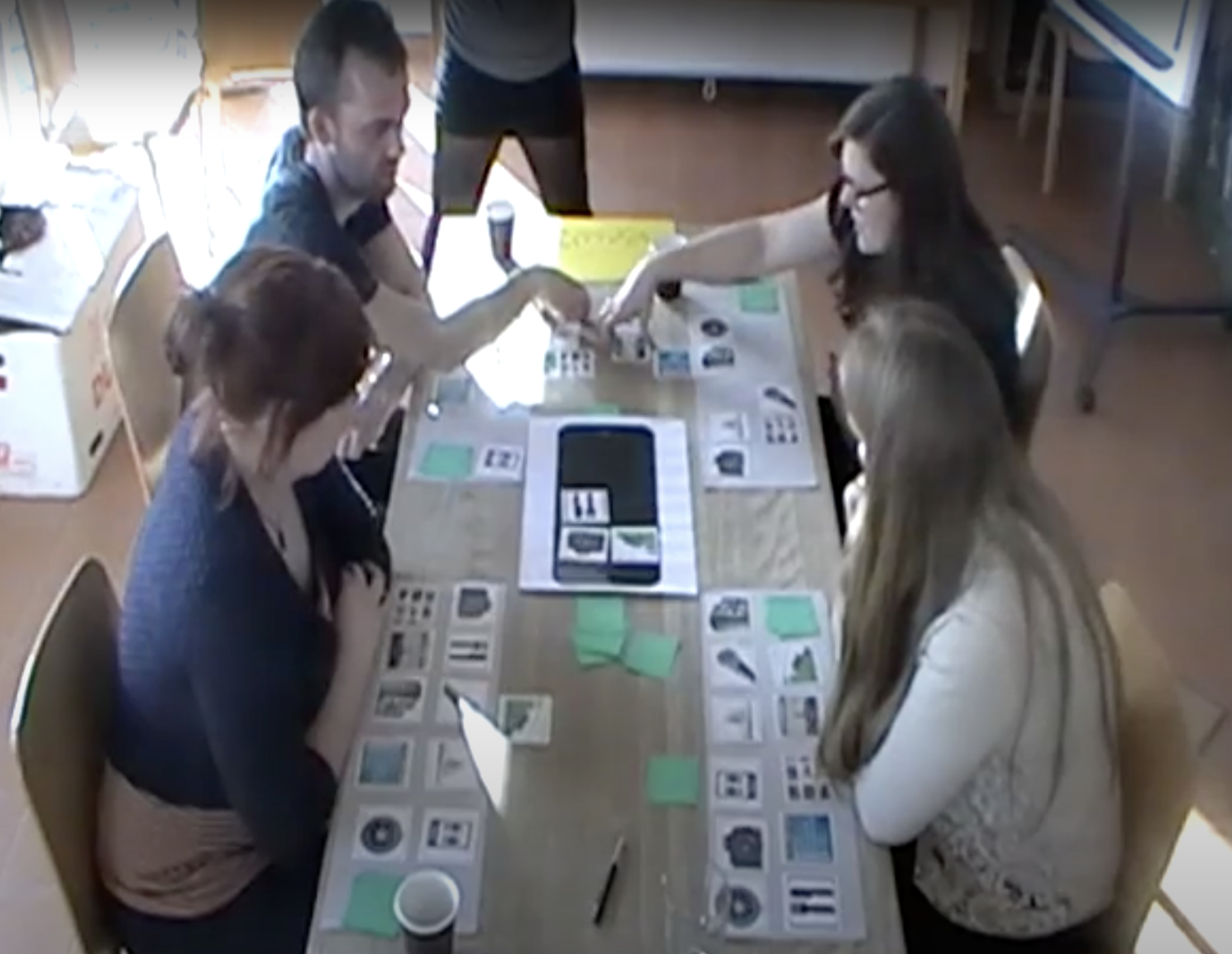
To get a holistic understanding of how potential users of Park West Amager normally engage with planning an outdoor trip and understand their needs, pains, and gains while visiting new places, we facilitated a 3-hour long workshop divided into two parts:
1. Let the participants tap into different stages of scenarios while mapping their user journey; their thoughts, feelings, tools, and comfort level.
2. Let the participants design their own toolboxes using the methodology Design Games, to gain insight into relevant features and value proportions in the app.
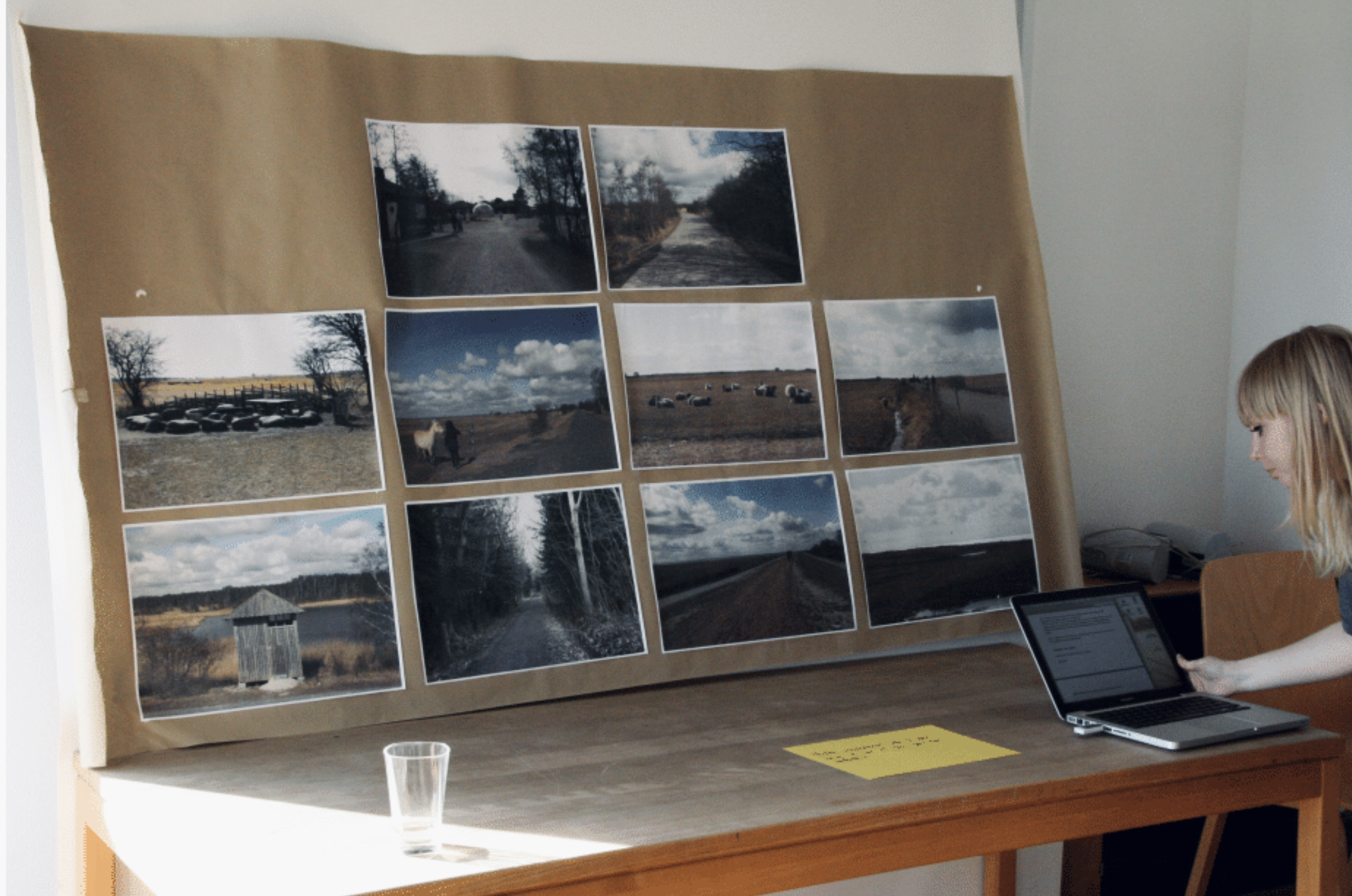
2. Synthesizing
To make sense of our initial user research and get to the clear meaning of our insights, we used different methods to synthesize our learnings.
We took tools from Human-Computer Interaction such as personas and user stories to clarify and translate insights into value propositions and ideas for features, while also using mapping tools like affinity diagrams to play around with the insight and analyzing user journeys.
Personas
User flows

use cases
Core User Needs
A clear introduction to Park New West Amager and its offerings
Many users did not know of Park New West Amager and had initial questions like “what is it?” “what can I do”, “is it really for me?” and “why should I go there?”. The users expressed a need for a clear introduction to the park with an emphasis on visuals, where they used a “movie trailer” as a metaphor.
The use of images, descriptions, and engaging onboarding was important to the users with a need for a clear introduction to the park.
Plan a visit that fits me and my interests
The users told us about their experience with traveling and day trips, where many used notebooks and guidebooks to plan and remember things to see and do. Some also took screenshots on their phone if they came by interesting stuff they wanted to remember. While feeling excited about planning some users also felt it could be stressful because of FOMO and feeling overwhelmed.
Being able to save points of interest and differentiate between activities based on interest was important for the users to easily engage with the park's offerings without getting overwhelmed.
A visual representation of the park and points of interest
When planning and arriving at new places the users express a need for being able to make themselves quickly familiar with their surroundings while trying to make an initial plan for their next steps. Some users also express fear of getting lost or missing out on things to experience and see.
The users wanted to easily be able to localize points of interest and figure out distances.
3. Prototyping
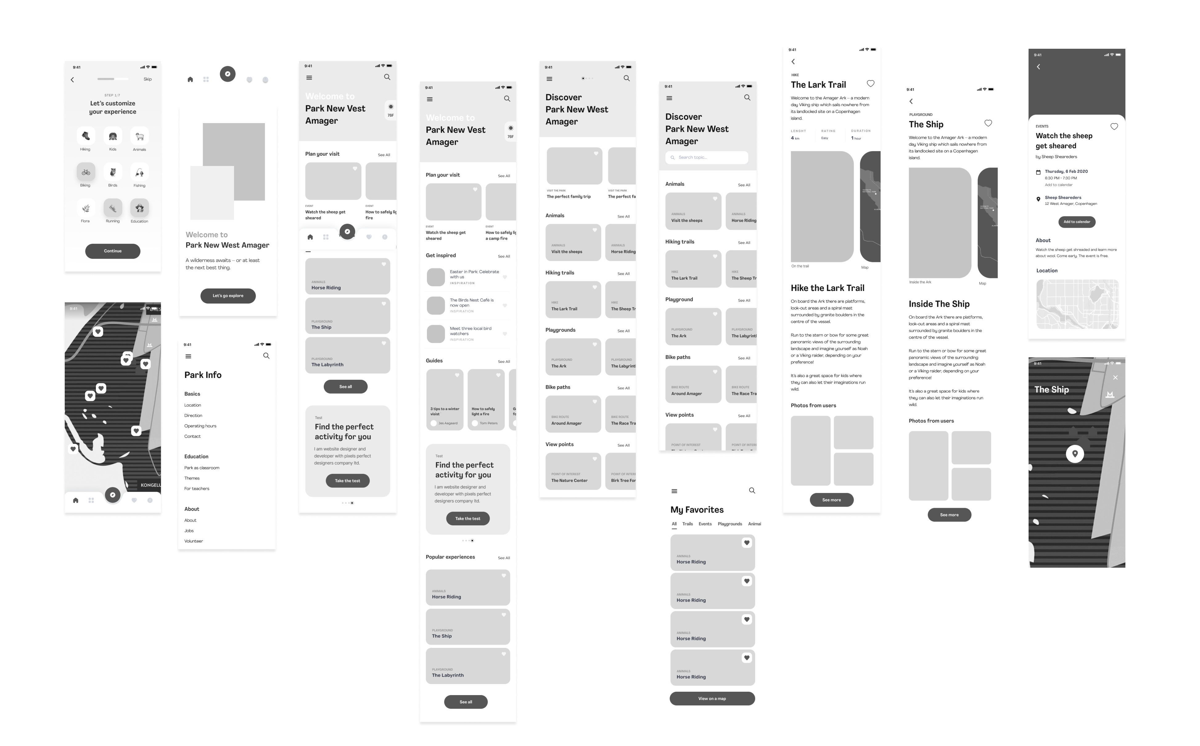
To take our ideas from the synthesizing and make them possible to test in a tangible way, we created a low-fidelity prototype - we wanted to both match the early stage of the design process and not confuse future test-users with the higher expectation to a high fidelity prototype. So low-fi it was.
Prototyping made us able to validate our ideas and take them to a more detailed level based on user flows while also designing micro-interactions and writing simple UX copy.

Low-fIDELITY
PROTOTYPING
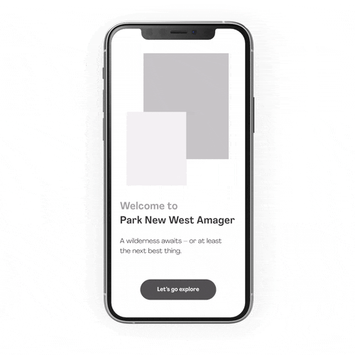
Need: A clear introduction to Park New West Amager and it's offerings
Splash Screen
We had a clear understanding of the importance of providing the users with a clear welcome message that would suck the users into the Park New West Amager experience while using the first tap to establish the user curiosity and engagement.
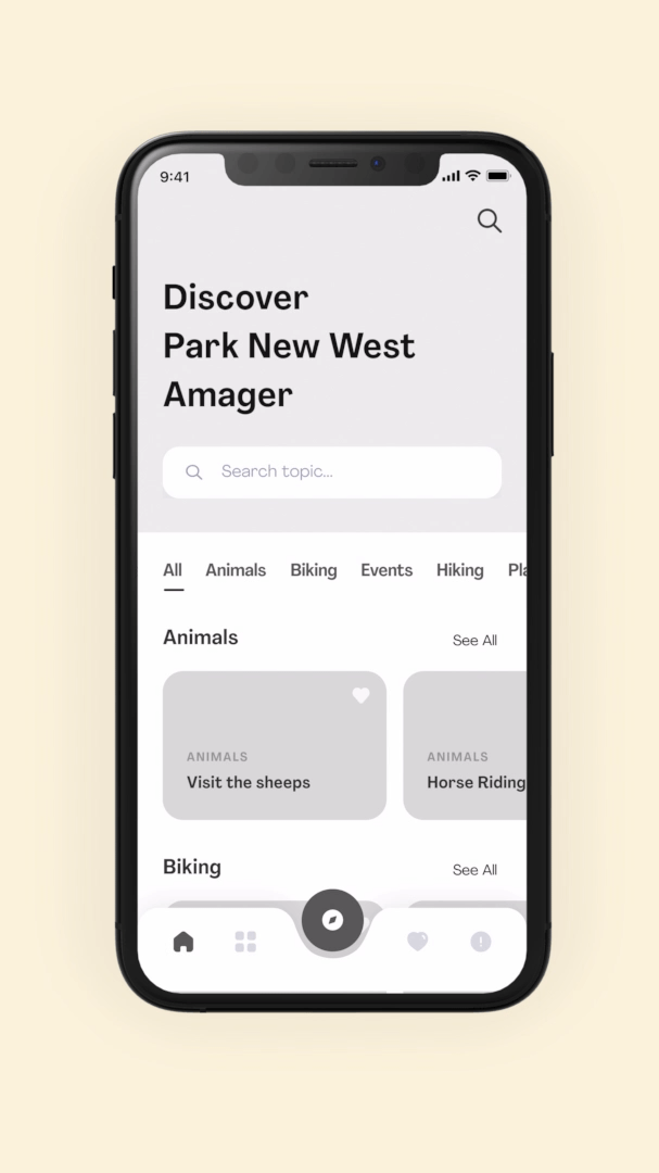
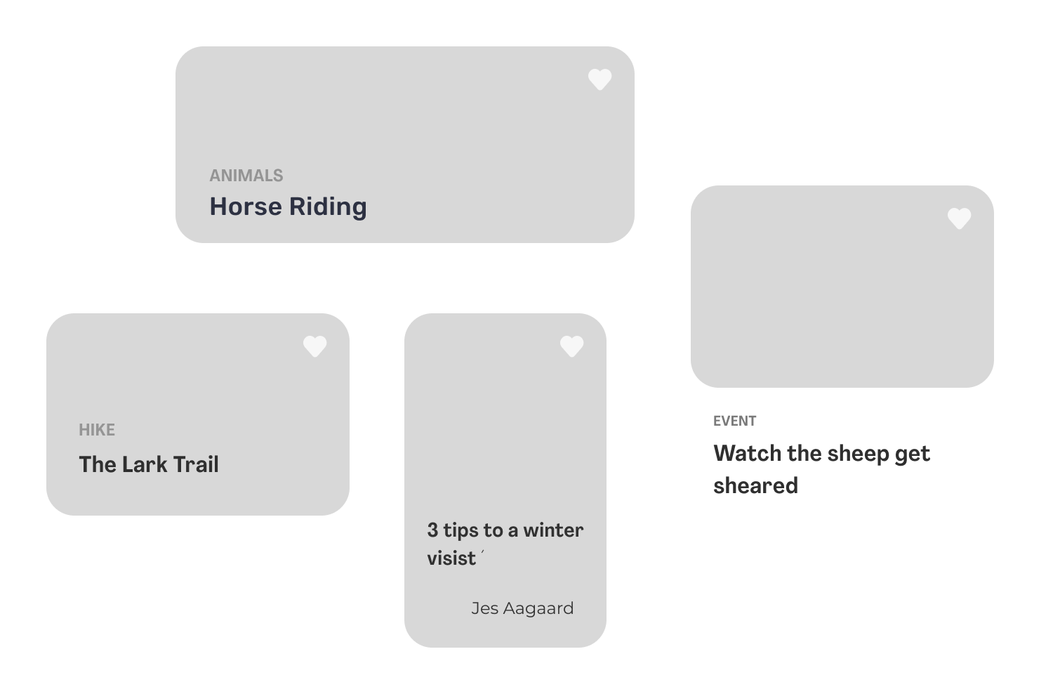
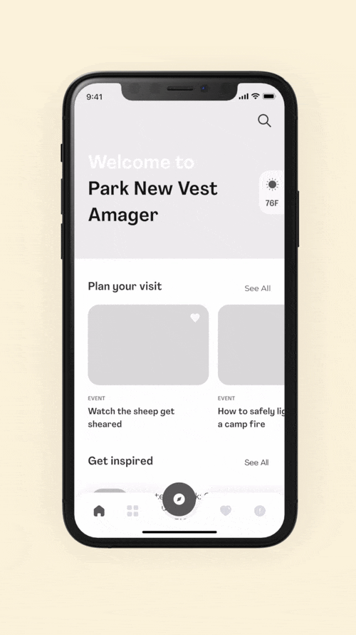
Home screen - horrisontal scrolling
By adding a home screen to the main navigation we had the intention of presenting the park's curated offerings. By using horizontal scrolling we were able to display a large catalog of items. In this case, we used horizontal scrolling to easily show current events and news at the top leading to an event page.
Home screen - tab Menu
To get a quick view of some of the parks' most popular offerings, we added a tab menu to filter the content by dividing the offerings into categories making it easier for the user to engage with the offerings they find most interesting.
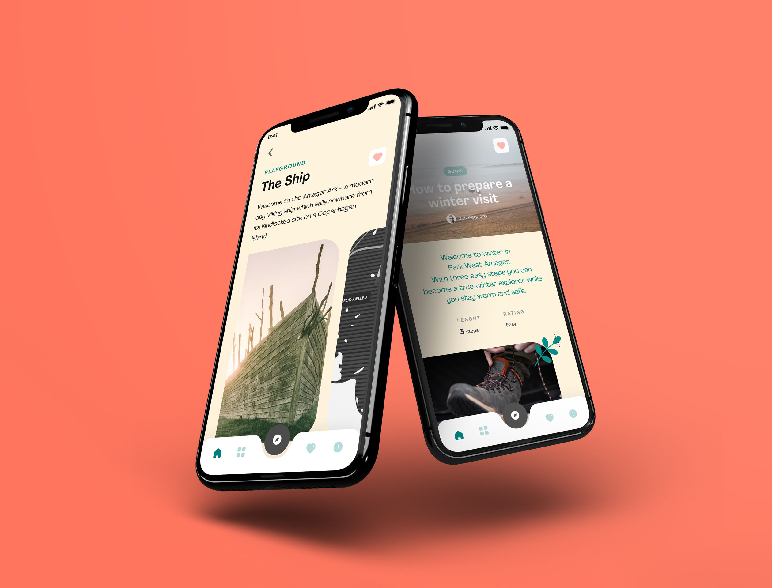
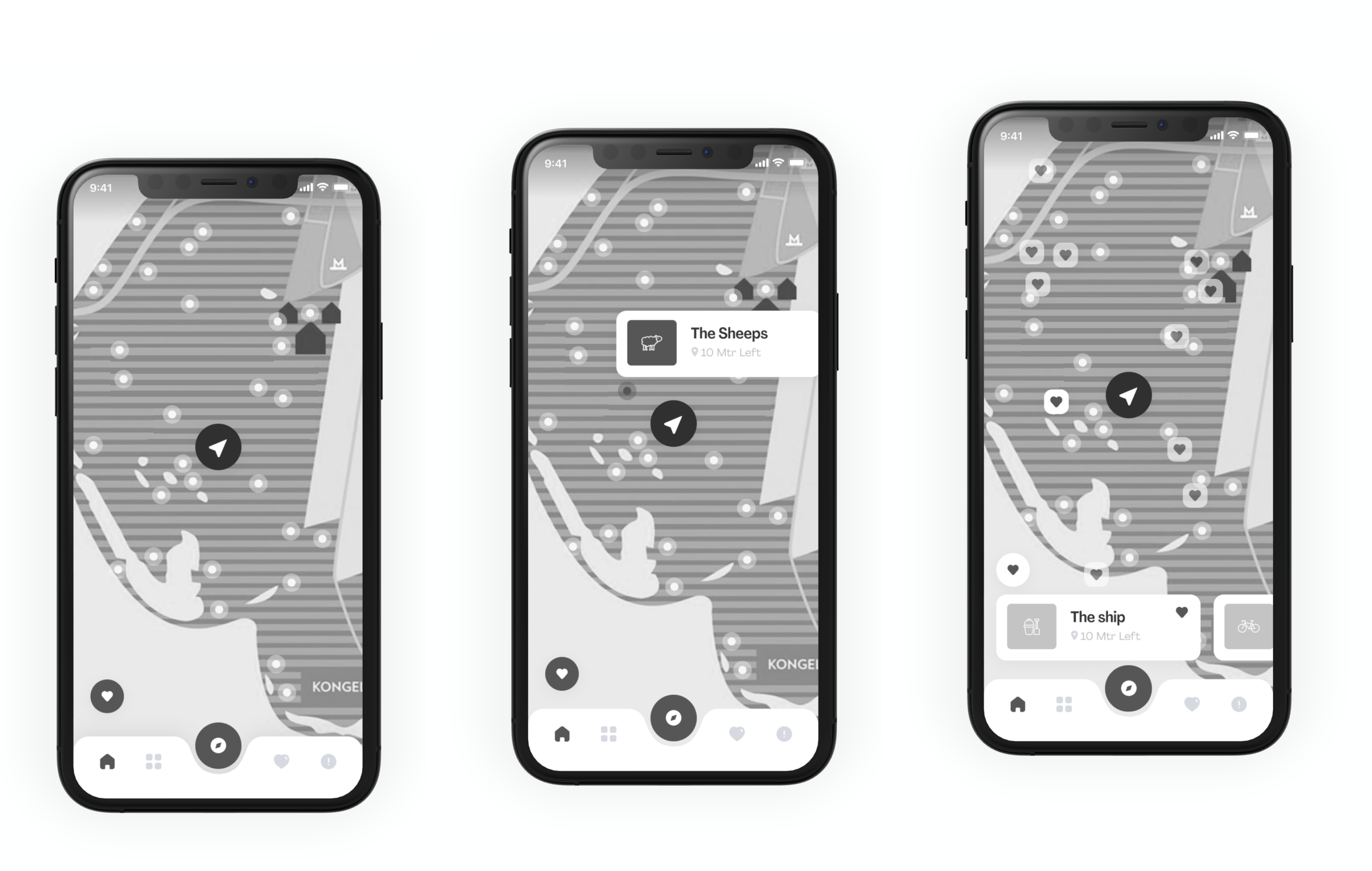
Need: A visual representation of the park and points of interes
Maps
To highlight the offerings of the park visually and to help the users to navigate the area, maps are an integrated functionality in the app in several different contexts.
In the bottom navigation, the map is highlighted as the main feature to emphasize its core value both while the user is planning and while the user is visiting. The map is also integrated on every POI page - from playgrounds to hiking trails, making it easy for the user to connect the digital experience with the physical visit.
Cards and pictures
Cards are used in the app as an easy way for the user to access the content. The cards are designed in different formats depending on the type of content, making it possible to differentiate between content by its recognizable look and placement. Every card is designed to contain pictures to enhance the visual representation.
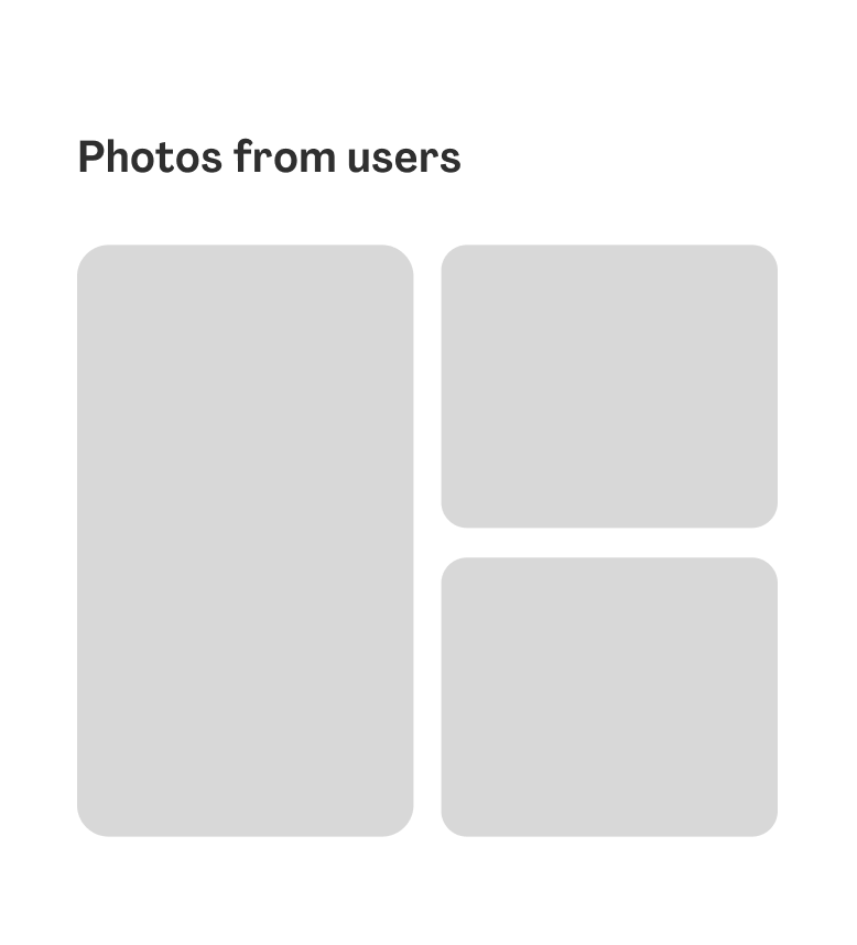
The app also showcases user-generated content by importing a feed from Instagram on each POI page, making it possible for users to see current pictures to assess weather and terrain from previous visitors.
Need: Plan a visit that fits me and my interests
Favorite content
With the need for being able to save information the user come upon and plan ahead (and maybe leave the heavy notebook at home) the possibility to favorite content in the app was important to the users. We implemented the well-known favorite interaction pattern; a heart, as a way to favorite content the user wants to save for later.
Favorite List
To access the saved content we made Favorites a destination in the bottom navigation. Here the user can easily access their favorite content.
Favorite Map
Making a strong connection between the digital experience of Park Vest Amager and the physical combined with users planning habits made integrating the location of the users' favorite POI on the map important. On the map, users can browse the area while choosing to include their favorites or not.
4. Contextual User Testing and Iterations
To gain insight into how users would respond to the app's user flows, features, and basic functionality in close connection to a physical park visit, we performed contextual user testing. The feedback would then inform the continued development of the app. We invited the users from the workshop to the open fields of Park West Amager and let them use the prototype to complete tasks based on different scenarios. During the test, we would talk to the users and observe+record their interaction within the prototype.
From the users, we gained new insight on interaction patterns and new ideas for improvements and new features for the next iteration. These are presented below.
The iterations
Iteration 1
Contextualizing the content with storytelling
By testing the prototype we recognized a need for more ways to contextualize the content within the app. The users expressed a more guided and inspirational way of engaging with Park West Amager's offerings and did not initially feel like they got the park's full story by simply being offered lots of content upfront. They wanted more storytelling.
Therefore, we implemented ways for Park West Amager to package their content in new forms - while also using the employees at the park as gatekeepers to tell the story.
The new features to enable this are:
- A "Get Inspired" section marked with the tag "Inspiration". Can contain news, articles, and interviews, etc. The Inspiration page is designed for a longer reading experience including related and/or current offerings in connection to the story.
- A "Guides" section is thought of as a way to highlight offerings coherently, guide users on how to engage with the offerings, and remove the fear of missing out. "You can just follow these simple steps the park ranger in chief has specified for you". Easy!
Iteration 2
More personalization
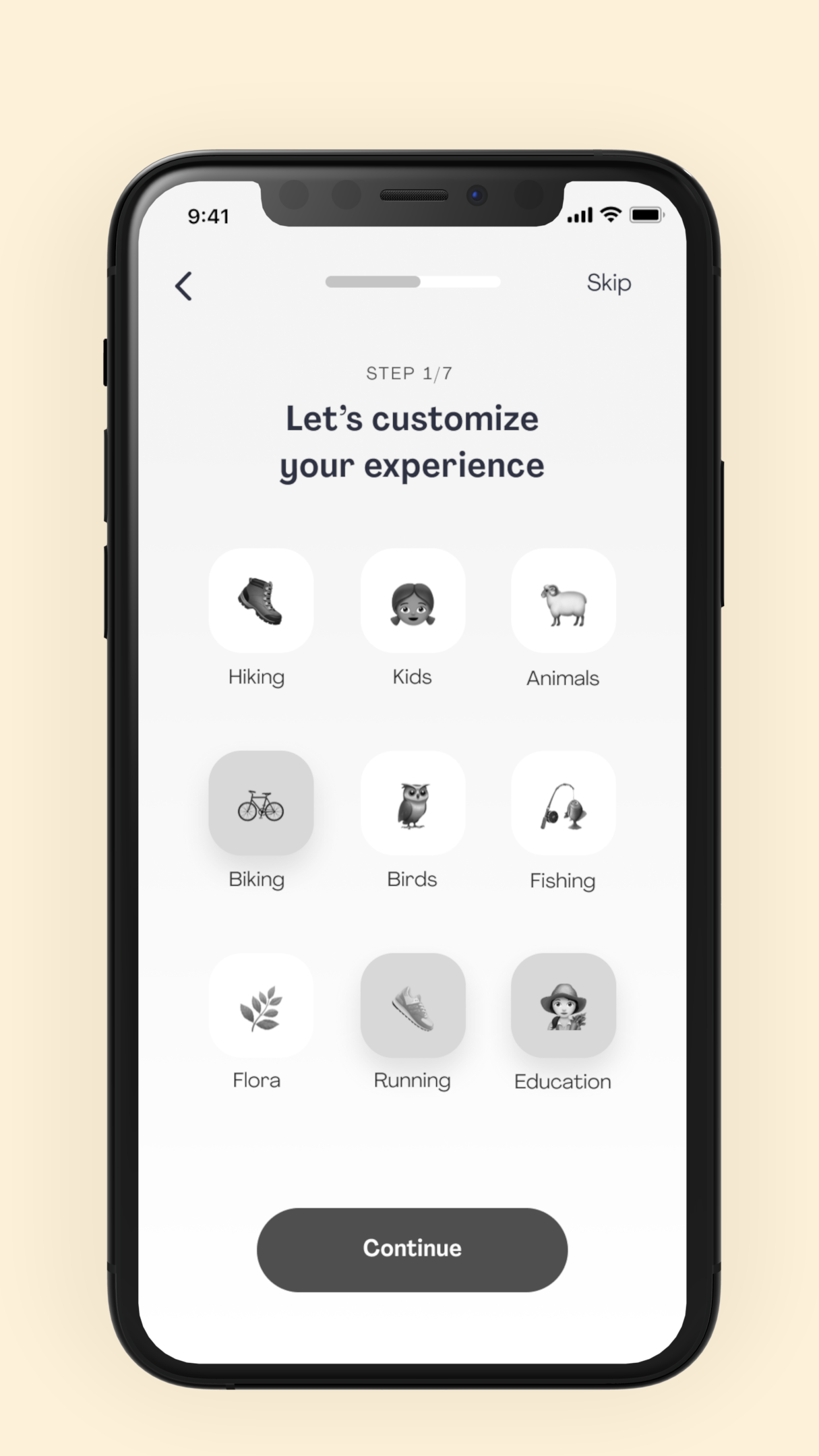
Tapping into the confusion about too much content and it becoming too overwhelming we took the idea from the "Find the perfect activity for you"-feature: A test that from the user's answers to some simple questions can highlight interesting offerings based on their specific interests, as a result.
While we did not design the onboarding for this app experience it made us want to include the test concept in the onboarding. Using the userøs input we would be able to better present a personalized user experience on the home page, highlighting offerings that fit the user.
Iteration 3
Easier ways to discover content
In the user testing, it was made clear that we needed to allow users to narrow down the huge set of results in the Discover section to simply make it easier to discover the content - especially when they were not interested in getting inspired but just wanted to navigate quickly to a specific offering.
To do this we implement new UX patterns; a search bar and a tab menu to filter between categories - also known for the Home section.